Discover the key differences between bronze color and copper color with hex codes uses and expert tips for design and decor choices.
Origins and Composition
Copper and bronze colors both draw from rich histories rooted in metallurgy and artistry. The pure essence of copper color comes from the natural metal copper itself—known for its vibrant reddish-orange glow. This warm, earthy tone reflects copper’s almost magical ability to develop a patina over time, shifting from bright and shiny to deep and rustic.
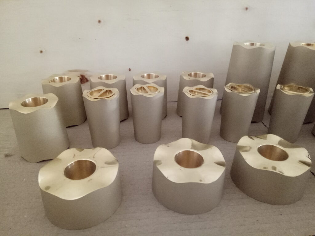
On the other hand, bronze color stems from an alloy mainly composed of copper mixed with tin or other metals. This blend creates a more muted, richer tone with hints of brown and gold, offering a depth that pure copper lacks. Bronze reflects strength and tradition, often associated with antique and vintage metal tones that carry a timeless sophistication.
Here’s a quick look at their key differences:
| Feature | Copper Color | Bronze Color |
|---|---|---|
| Composition | Pure copper metal | Copper alloy (copper + tin/others) |
| Hue | Reddish-orange | Brownish with golden undertones |
| Patina Development | Turns greenish (verdigris) | Darkens to deep brown or greenish |
| Common Use | Decorative accents, jewelry | Statues, medals, hardware |
Locally, copper’s warm orange glow often symbolizes warmth and vitality, while bronze’s layered, earthy tone is linked with heritage and durability. Whether you’re choosing for design or craft, understanding these origins can help you pick the perfect metallic shade.
Explore Vastpcc’s copper-inspired palettes to bring authentic metallic finishes to your projects—feel the natural warmth and timeless elegance in every hue.
Visual Differences Between Bronze Color and Copper Color
When comparing bronze color vs copper color, their visual differences stand out mostly in hue and tone. Copper has a brighter, reddish-orange glow that can look vibrant and warm, especially under natural light. Bronze, on the other hand, carries a deeper, earthier brown tone often with subtle green or gray hints, thanks to its alloyed nature.
Hue Tone and Lighting Tricks
- Copper color shines with a metallic orange tone that can feel fresh or vintage depending on lighting.
- Bronze color appears richer and darker, shifting subtly with shadows to warmer or cooler shades.
- Under bright sunlight, copper’s reddish orange tone pops, while bronze’s muted brown shows off a more antique feel.
- Indoor or dim lighting tends to mute copper’s vibrancy, making it look closer to bronze.
Hex Codes Swatches and Digital Tools
For digital projects or paint matching, here are typical hex codes to visualize these colors:
| Color | Hex Code | Description |
|---|---|---|
| Copper | #B87333 | Bright reddish orange copper |
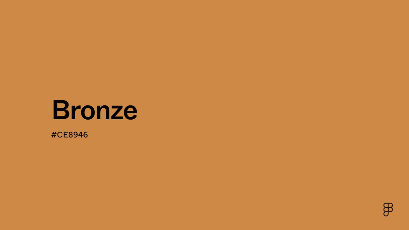
| Bronze | #CD7F32 | Earthy brown bronze |
Using tools like Adobe Color or color pickers in design software can help you compare these in your exact lighting.
Visual Aid Tell-Tale Signs
- Copper is unmistakably warmer and redder in tone.
- Bronze leans toward a more muted, brownish metallic look.
- When deciding between bronze color hex code vs copper orange tone, think about the mood you want—vibrant and punchy (copper) or subtle and vintage (bronze).
By knowing these visual traits and using hex codes, you can easily pick the right metallic shade whether in paint, digital designs, or décor. For authentic finishes, explore Vastpcc’s copper-inspired palettes tailored for true-to-life colors that catch the eye.
Practical Applications of Bronze Color vs Copper Color
When it comes to using bronze and copper colors, each brings unique energy to different spaces and projects, especially here in the US where warm, earthy shades are popular.
Interior Design and Home Decor
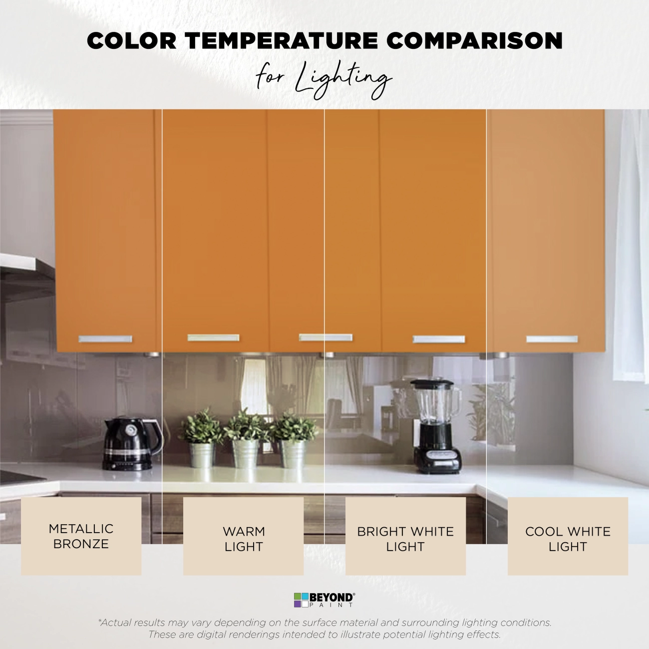
Copper color often adds a bright, reddish-orange glow perfect for accent walls, lighting fixtures, and kitchen backsplashes, creating a cozy, inviting vibe. Bronze color, with its deeper, antique metal tones, works great for furniture finishes, decorative hardware, and frames, giving rooms a timeless, rustic feel. Many designers blend both for layers of warmth that match American homes’ love for natural, warm color palettes.
Fashion Crafts and Beyond
In fashion, copper’s reddish brown hues highlight bold accessories and statement pieces, while bronze offers an earthy gold variation suited for vintage-inspired jewelry, watch faces, or leather accents. Both colors fit well in autumn collections and warm seasonal trends, favored especially by US consumers who appreciate grounded yet flashy metallic paint shades.
Cross-Industry Uses
Beyond decor and fashion, these colors shine in automotive finishes, industrial design, and even tech gadgets where copper’s brightness delivers modern flair and bronze’s alloy depth provides classic durability. Patina development on both metals is popular for adding character to outdoor fixtures and architectural accents, which fits well with urban and suburban American aesthetics.
Local Habits
Here in the States, you’ll find a growing tendency to mix these colors to create hybrid looks—balancing copper’s vibrance with bronze’s subtlety. This reflects local tastes toward customization and authentic, layered metallic finishes.
Shop Vastpcc’s bronze-copper hybrid paints for seamless blending and authentic metallic results in your next project.
Pros Cons and Head-to-Head Showdown
Here’s a clear breakdown comparing bronze color vs copper color on key factors like durability, versatility, cost, and maintenance.
| Feature | Bronze Color | Copper Color |
|---|---|---|
| Durability | Highly durable thanks to alloy mix; resists corrosion better | Prone to patina and tarnishing; needs regular upkeep |
| Versatility | Warm earthy tones work well indoors and outdoors | Vibrant reddish brown hues great for accent pieces |
| Cost | Generally more affordable due to alloy components | Pure copper color can be pricier, especially in paint form |
| Maintenance | Low maintenance; ages attractively | Requires polishing or protective coatings to keep shine |
Pros and Cons at a Glance
Bronze Color Pros
- Lasts longer without fading
- Blends easily with vintage decor and neutral tones
- Offers a subtle metallic look without too much shine
Bronze Color Cons
- Less vivid than copper; can feel muted
- Limited sparkle may not suit all design themes
Copper Color Pros
- Striking bold tone that pops in any setting
- Perfect for warm color palettes and antique metal tones
- Develops beautiful patina over time for character
Copper Color Cons
- Needs upkeep to avoid dullness and greenish patina
- Higher cost limits its use in large areas
Decision Framework Quiz
- Want something low-maintenance and classic? Go bronze.
- Need a bold, standout hue with rustic charm? Copper’s your pick.
- On a budget but want metallic warmth? Bronze wins.
- Love authentic vintage or industrial style? Copper nails it.
This quick guide helps you pick the right metallic shade for your project, tailored for U.S. homes and businesses looking for earthy gold variations and antique metal tones.
Expert Tips for Choosing and Using Bronze vs Copper in Your Projects
When deciding between bronze color and copper color, knowing how to pair them well can make all the difference.
Color Pairing Mastery
- Bronze goes great with: deep greens, warm creams, and navy blue. These tones highlight its rich, earthy metallic feel.
- Copper pairs best with: soft blues, muted grays, and ivory whites. These contrast its vibrant reddish-orange hue to balance warmth.
- Use both in neutral spaces where you want a subtle metallic accent without overpowering the room.
Common Pitfalls and Fixes
- Avoid mixing bronze and copper in the same space without a clear plan. Their similar warmth can clash if not balanced properly.
- Fix dullness by adding lighting that brings out metallic shine—natural light works wonderfully on both.
- Don’t forget to test paint samples before committing. Slight variations in sheen or tone can shift the whole vibe.
Local Optimization Quick Hacks for Urban Dwellers
- In city apartments with limited natural light, opt for copper color accents. Its brighter, warmer tone lifts compact spaces.
- For homes with lots of natural light, bronze color adds cozy warmth that complements sunlight beautifully.
- Use local paint stores or online resources like Vastpcc to get samples and advice tailored to your area’s lighting and style trends.
Ready to make your space pop with authentic metallic finishes? Book a free Vastpcc color consultation to match your vibe and get expert guidance on bronze vs copper color choices.